Responsiveness: Auto-Layout
Figma's native Auto-layout translates into dynamic, responsive layout when used with Anima
What is Auto Layout?
Auto layout is a Figma property that you can add to your frames and components. It allows you to create dynamic frames that will automatically resize to maintain the layout structure you’ve established.
For example, you can use Auto-layout to make elements 100% wide and extend with the browser, or in order to align them to the sides or to the center.
How to add Auto-Layout
Before adding auto layout to individual components, be sure to add it to the main frame you're working with so that the whole frame will be responsive.
- Select a frame, component, or a group.
- Use the keyboard shortcut Shift A or click ‘+’ next to auto layout in the right sidebar.
- Adjust auto layout properties to your design preferences and needs.
Auto layout properties
- Layout direction - allows your layout to be structured in columns (horizontal) or rows (vertical)
- Spacing - controls the spacing between your objects
- Padding - determines the whitespace around your objects
- Alignment - describes how the children elements are aligned within the parent frame
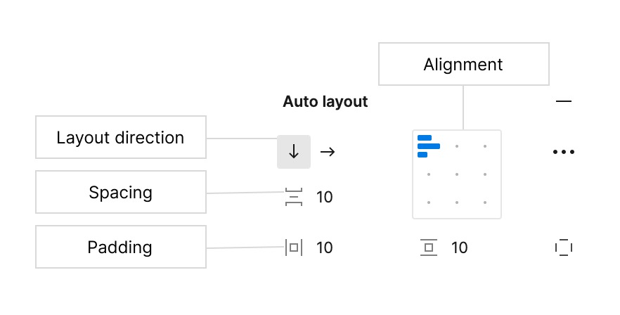
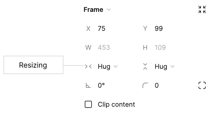
- Resizing - lets you have a dynamic (hug) or fixed width
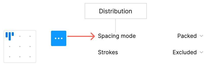
- Distribution - determines how objects are distributed within the frame
Test out your auto layouts in Figma by shrinking and expanding your frames to make sure they work properly before you preview and sync to Anima!
If you wish to practice Auto-layout, refer to this section.
Preview or Sync or Publish to see Auto-layout in action.
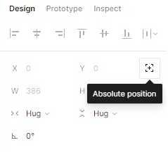
Absolute Positioning in Auto Layout
So, you have created your auto layout but now you need to add an element outside of its bounds, without breaking it? No problem, this is where absolute positioning comes in!
Absolute positioning is one of the latest features Figma has added to auto layout and it's a game changer! It allows you to exclude an element from the auto layout properties, without having to remove it from the frame itself.
How do you add it? It is very simple!
After adding the elements of a given section to an auto layout frame, simply select those elements you wish to exclude from the auto layout properties and enable absolute positioning on them. You can do so by clicking the button at the top right of Figma's Design panel, just below the alignment options.
Example
The auto layout feature can be tricky to learn, follow these steps to learn how to create a responsive header:
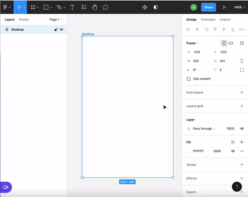
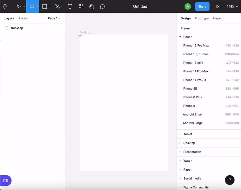
1. Create the main container
Select your main frame (in this case Desktop) and add auto layout. Then, make sure to set the frame to Fixed for both the Width and Height. Why? Because setting it to "Hug" will resize this frame to hug the elements contained within it, which in this case, is not what we want.
Afterwards, on the auto layout properties, set it to Top Center and keep all the padding options to 0. This frame will act as a wrapper or main container for the rest of the Auto-Layouts inside, ensuring their responsiveness. The padding will be set for the internal containers we will create later.
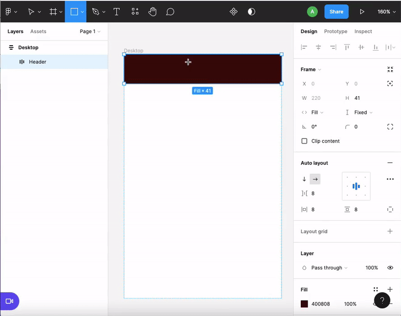
2. Create the Header:
Add a rectangular frame (this will act as the header), then add auto layout and set the padding to 8. (We have chosen 8 because using multiples of 8 is common practice in the design world as it helps scale designs in an easy and consistent manner to different screen sizes.) This header will contain the icons, so setting up its auto layout properties correctly will ensure that the icons are resized and distributed responsively!
3. Create the Icons
Add a square inside the header (this will act as an icon) and duplicate it to create as many icons as you wish. If you have already set up the auto layout properly, this header will be fully responsive and good to go!
Extra Tip: Be sure to test all your frames' responsiveness by scaling them vertically and horizontally in Figma before syncing to Anima!
Suggest Auto Layout
Since Figma's latest updated UI was released, there is the option to use the new "Suggest Auto-Layout" feature. You can try it out by right-clicking the desired frame/layer and selecting "Suggest auto layout".
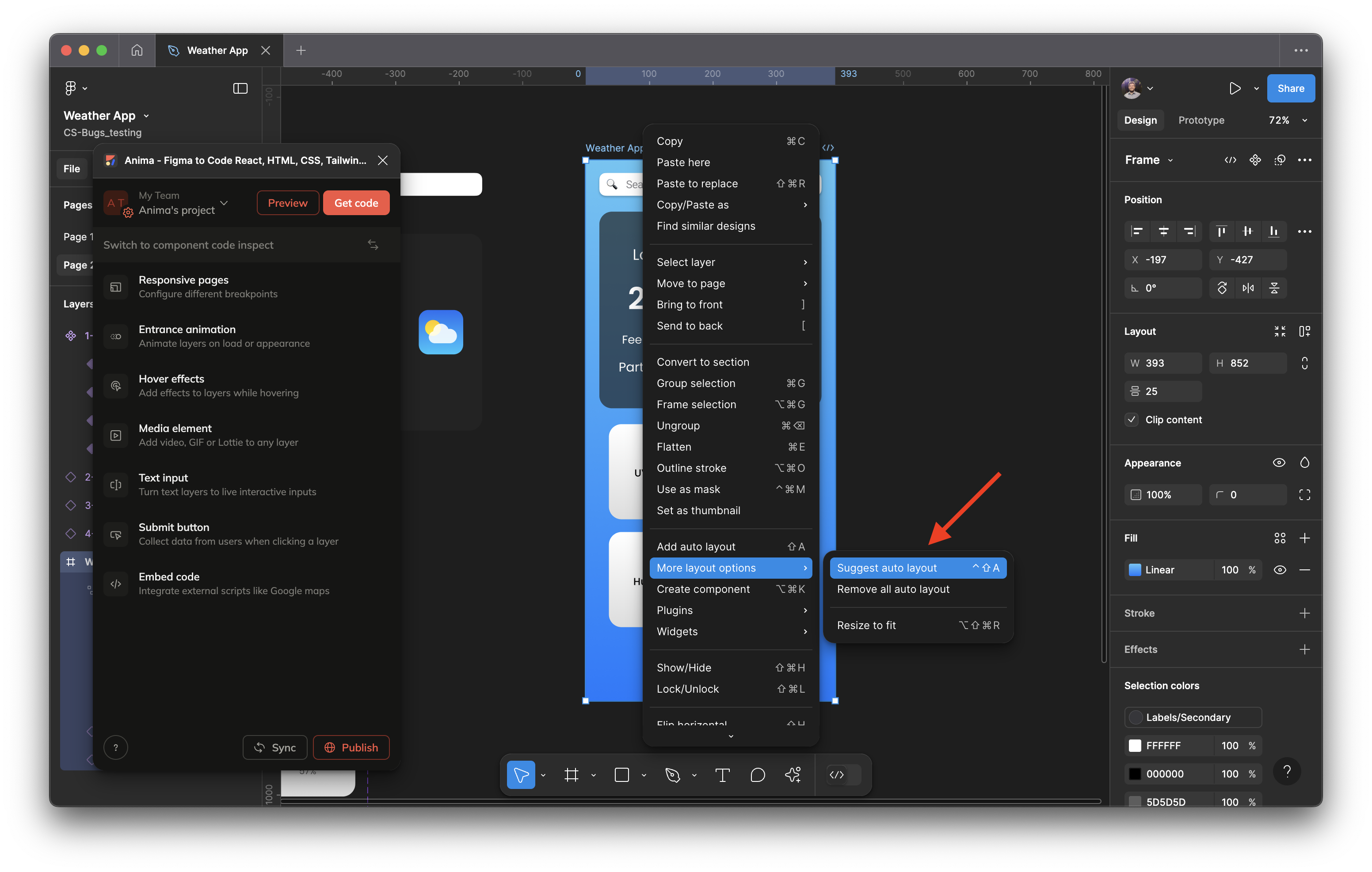
Please note that the results may need some adjustments.
Updated 6 months ago