Responsiveness: Breakpoints
Connect multiple frames that represent different page layouts into the same page
Using breakpoints, Anima ensures that your design automatically adjusts to look its best, whether it’s being viewed on a compact smartphone, a tablet, or a widescreen monitor. The right layout will show.
What are Breakpoints?
A breakpoint is a specific point at which a website’s content and design will adjust to accommodate the screen size or resolution being viewed.
Today, the convention is to have a different artboard representing the page layout for Desktop, Mobile, and sometimes even tablet or wide desktop. Each of these artboards stands for a breakpoint.
Use Breakpoints to make your design look great in any screen size.Complete the experience with Auto-layout.
How to use Breakpoints
-
Design with multiple layouts
The process begins in Figma, where designers create variations of their pages for different screen sizes. Typically, at least two or three versions, such as mobile, desktop, and tablet.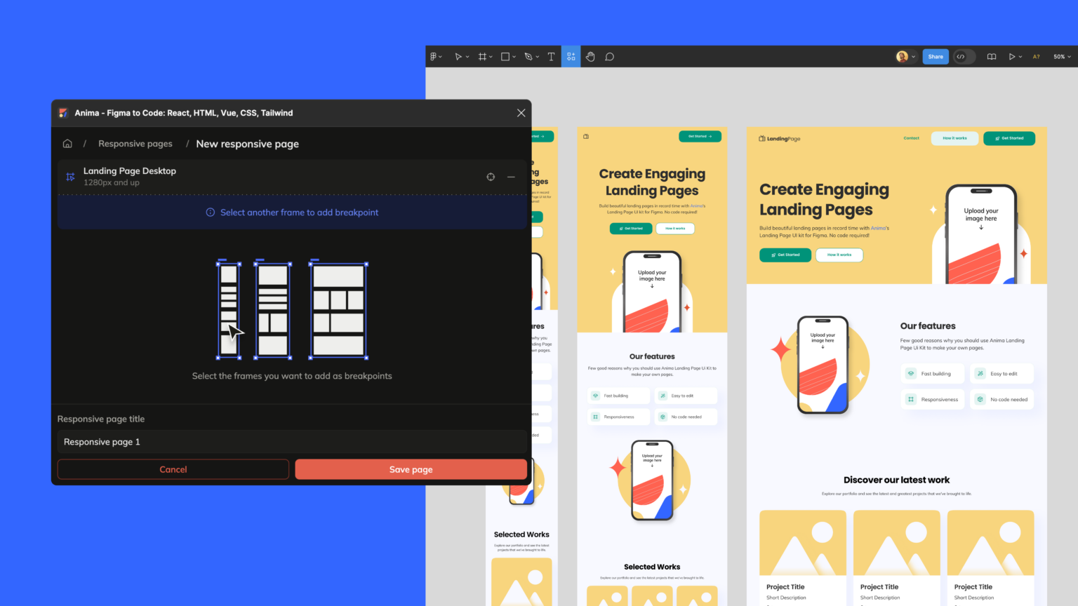
-
Connect artboards with Anima’s Breakpoints feature
Select all the artboards of the same page (I.e. “homepage mobile” & “homepage desktop”), then use Anima’s plugin for Figma, and click “Responsive pages” → “+” → “Save”.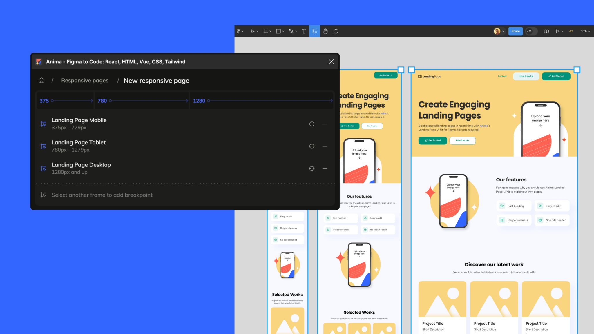
-
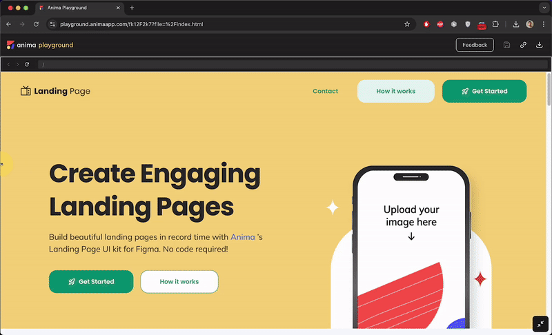
You may Publish your design to get a public link
This is what the result will look like:
More on Breakpoints
- Multiple screens and Figma links – Anima supports Figma prototype links out of the box, and multiple pages may have their breakpoints.
- Breakpoints & Auto-layout – Figma auto-layout is also supported. And using AL would give an even better experience on your pages.
- The CSS behind the scenes – Anima uses CSS Media queries to jump between your different layouts according to screen width.
- What width should I have my artboards for best performance?
- The artboard width should represent the minimum width of this layout.
- I.e. using 1200px for Desktop and 350px for Mobile – This would show Mobile layout for any screen with less than 1200px width. Below 350px, it’ll keep a minimum of 350px (usually zoomed out on mobile browsers rather than scrolls).
Transforming a Figma design into a responsive website with Anima streamlines the development process, allowing designers and developers to work closely from the initial design phase to the coding phase.
Updated 6 months ago