Responsive Design
Adobe XD’s responsive resize constrainits make it easier to design for multiple screen sizes. With Anima, you can create fully responsive designs that can be resized both in the browser preview and in the code.
Preview Live Website | Download Sample File
How Does it Work?
An element’s responsive constraints are set in relation to its nearest parents. A parent can be an artboard, a group, or a component/symbol.
FOR EXAMPLE
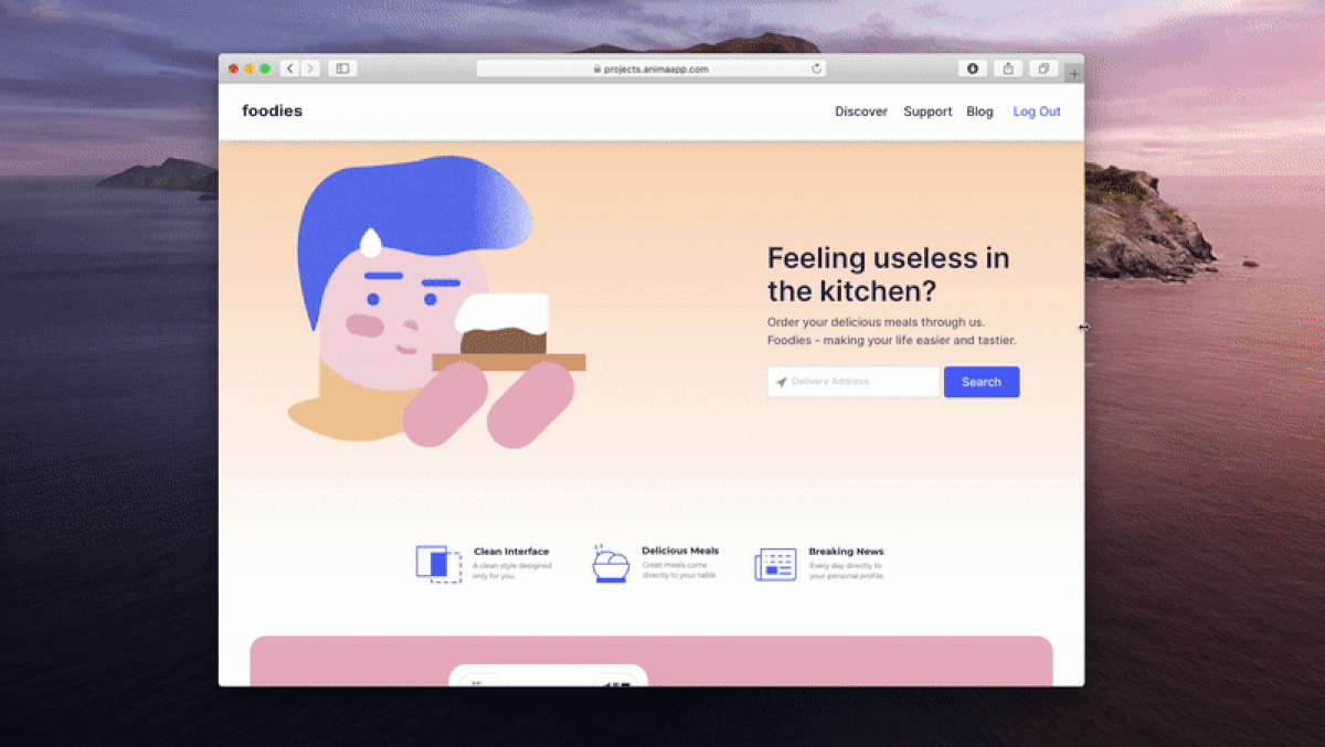
- If we want a background layer to stretch full width when its parent, the “Homepage” artboard, gets wider, we need to select Left, Right from the Responsive Resize
- And if we want it to keep the same distance to the top of its parent at all times, select Top

Learn about Adobe XD’ Responsive Resize
Responsive Resize inside Groups and Components
As mentioned, the responsive settings apply in relation to the element’s closest parent. This means that if the elements are inside a Group or a Component, these too need to have responsive settings applied to them.
For example:
Inside this Navigation group (Parent), we want the:
- White Background to stretch the full width
- Foodie logo to stay 30px from the left corner
- Group of navigation Links to stay 30px from the right corner
- The entire Group (Parent) to stretch when its parent (the artboard) is stretched
We can achieve this by adding the following resize constraints:

Constraints + Breakpoints
If you have more than one screen size, connecting them with Breakpoints and adding Responsive Resize is a very powerful combo! They will create a very smooth transition between all your screen sizes. Try it out!

Learn how to create Breakpoints with Anima for Adobe XD.
Preview it!
Click “Preview in Browser” in the Anima plugin to see it come to life!